Create a custom Granite UI adapter to disable the Multifield component
Nate Yolles | January 21, 2016 | 711 comments |
Adobe Experience Manager's Granite UI introduces the concept of Adapters. Adapters are a client-side device inspired by Apache Sling's
Adapters and its
adaptTo method. Adapters are an easy and clean way of creating APIs for commonly used functionality associated with specific objects. Adapters attach functionality to DOM elements according to
vocabulary. Vocabulary is analogous to Java Interfaces.
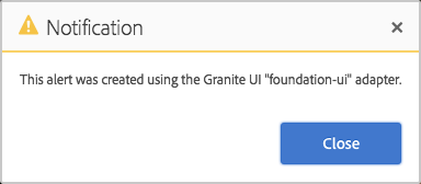
The first Adapter that you're likely to encounter is the
foundation-ui. The
foundation-ui is an object, adaptable from the global window object, that gives you the power of creating Coral UI alerts, notifications, prompts and loading indicators. Try copying the following JavaScript into the console of any Touch UI authoring page.
There are a variety of adapters which you can find in the
Granite UI documentation. There are more adapters that are not listed in the documentation such as the
foundation-clipboard which allows an easy API to write to local and session storage. So be sure to explore
/libs/granite/ui/components/foundation/clientlibs/foundation/js.
It's easy to write your own adapters. Granite UI foundation components come with the
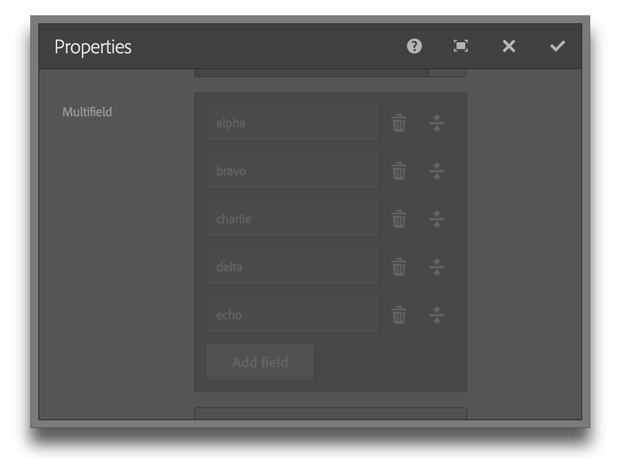
foundation-field vocabulary. However, in this example we're going to create an improved adapter with an API that will completely disable the component by disabling the add button, all input fields, the remove and the drag-and-drop reorder buttons. We'll also add an additional method to enable/disable only the add button which could be useful in applying a max limit to the Multifield component.
Use the
foundation-registry adapter to gain access to the Registry API where you can register a new adapter. The
type property is the name of the adapter. The convention is to use the application name followed by the topic. The
selector attribute identifies eligible objects, usually a DOM element or the window object. The target object to be adapted need not be obtained by using the declared selector, but it must satisfy the selector. The
adapter property is where the public APIs are defined and executed.
In this example, we actual register three separate adapters. The Multifield component is essentially a composite of other components, so we'll use the parent adapter to delegate functionality to the children component's own adapters. Input fields such as textfields and selects can use the provided AEM foundation-field adapters, however, we needed to create new adapters for standard buttons as well as drag-and-drop reorderable buttons. The new adapters were created using the application's namespace rather risking collision with future AEM updates.
To make use of the API, use jQuery to get the Multifield component, adapt it to the custom vocabulary and run the custom
disabled method.
Multiple adapters can be created for any selector. The AEM provided
foundation-field adapter is still available to the
.coral-Multifield selector even when the example code is used. To make your adapter available when authoring in the Touch UI, ensure that it's in a clientlib that identifies the
cq.authoring.dialog category.