
Nate Yolles | February 25, 2016 | 999 comments |
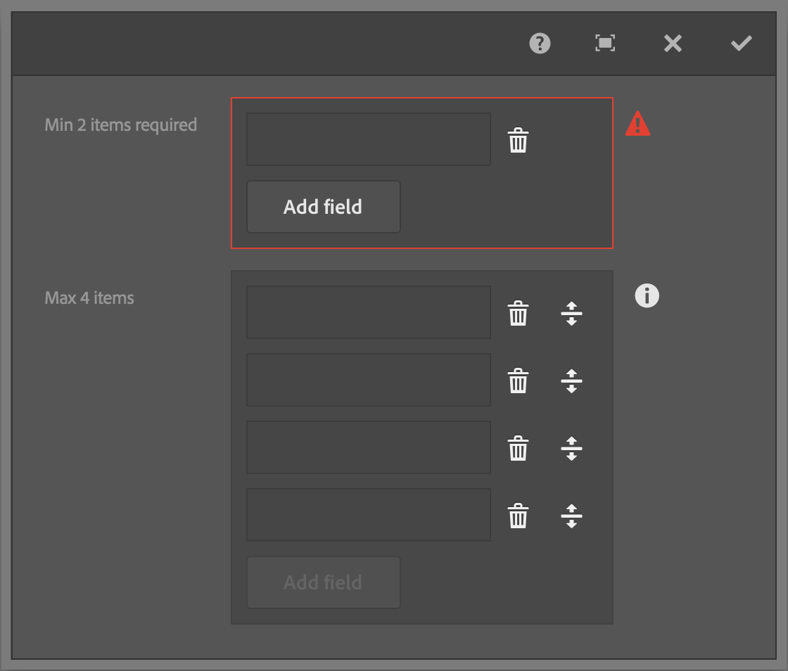
Adobe Experience Manager's Touch UI provides a straightforward validation framework making it simple to create custom form element validators as well as to interface with them programmatically. This blog post details the inner workings of the
AEM Touch UI Validation Library which provided unobtrusive validation and enhanced functionality to AEM's Granite UI foundation dialog components.
Registering custom validators is done by calling the jQuery based
$.validator.register method. The register method takes a single JavaScript object literal argument. The parameter looks for four properties:
selector,
validate,
show and
clear, of which only
selector is required.
The following example creates a custom validator for phone numbers in a Touch UI dialog. Note that
show
and
clear
methods are not necessary in this example as the validator would use the default AEM provided methods, however, they are included for reference.
The
selector property ties the validator to the form elements on the page. The property accepts any jQuery selector such as a class (
.my-class-name), type (
INPUT) or attribute (
INPUT[type="text"]) selectors.
The
validate property is the function that validates the form element's input. The function provides the form element as a jQuery object as the single available parameter. The field is treated as invalid if this function returns a string literal as the validation error message.
The
show and
clear properties are functions that update the UI when when the form element is determined to be invalid or valid respectively. Each function makes two parameters available, the form element as a jQuery object and the validation message.
The
selector property is obviously required, otherwise the validator can never be called. However, the
validate,
show and
clear are optional. For example, if a form element is already being validated through an existing validator, you can update the UI behavior of the error message by registering a new validator with only
show and
clear functions. Order of registration is important; the last validator registered is the first validator used. View the
Granite UI Validation documentation for further information. AEM's default validators are located at
/libs/granite/ui/components/foundation/clientlibs/foundation/js/validation/validations.js
.
The most obvious reason for providing custom
show and
clear functions is to validate a custom dialog component. For example, in the
AEM Touch UI Validation Library, the two functions are used in the multifield validator as the field used is an HTML textbox to validate and it's not in the same HTML structure as the other HTML textboxes that the default AEM validator has already registered.
The benefit of using the provided jQuery.validator plugin is that it becomes trivial to create custom validation with a consistent UI provided by AEM out-of-the-box. As you write your custom validators, note that the jQuery.validator plugin attempts to mimic the default HTML5 validation and more importantly, note that hidden fields are not validated.
AEM provides a simple jQuery API to interact with form elements:
Using the principles described in this blog post, I've created the
AEM Touch UI Validation Library to provide enhanced validation to Granite dialog components such as the multifield, browserpath, radiogroup and autocomplete.

Nate Yolles | January 21, 2016 | 711 comments |
Adobe Experience Manager's Granite UI introduces the concept of Adapters. Adapters are a client-side device inspired by Apache Sling's
Adapters and its
adaptTo method. Adapters are an easy and clean way of creating APIs for commonly used functionality associated with specific objects. Adapters attach functionality to DOM elements according to
vocabulary. Vocabulary is analogous to Java Interfaces.
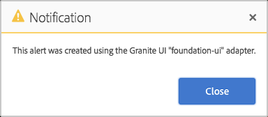
The first Adapter that you're likely to encounter is the
foundation-ui. The
foundation-ui is an object, adaptable from the global window object, that gives you the power of creating Coral UI alerts, notifications, prompts and loading indicators. Try copying the following JavaScript into the console of any Touch UI authoring page.
There are a variety of adapters which you can find in the
Granite UI documentation. There are more adapters that are not listed in the documentation such as the
foundation-clipboard which allows an easy API to write to local and session storage. So be sure to explore
/libs/granite/ui/components/foundation/clientlibs/foundation/js.
It's easy to write your own adapters. Granite UI foundation components come with the
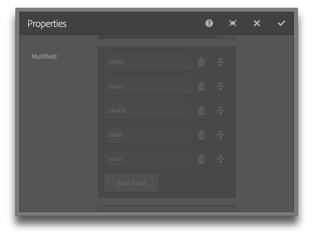
foundation-field vocabulary. However, in this example we're going to create an improved adapter with an API that will completely disable the component by disabling the add button, all input fields, the remove and the drag-and-drop reorder buttons. We'll also add an additional method to enable/disable only the add button which could be useful in applying a max limit to the Multifield component.
Use the
foundation-registry adapter to gain access to the Registry API where you can register a new adapter. The
type property is the name of the adapter. The convention is to use the application name followed by the topic. The
selector attribute identifies eligible objects, usually a DOM element or the window object. The target object to be adapted need not be obtained by using the declared selector, but it must satisfy the selector. The
adapter property is where the public APIs are defined and executed.
In this example, we actual register three separate adapters. The Multifield component is essentially a composite of other components, so we'll use the parent adapter to delegate functionality to the children component's own adapters. Input fields such as textfields and selects can use the provided AEM foundation-field adapters, however, we needed to create new adapters for standard buttons as well as drag-and-drop reorderable buttons. The new adapters were created using the application's namespace rather risking collision with future AEM updates.
To make use of the API, use jQuery to get the Multifield component, adapt it to the custom vocabulary and run the custom
disabled method.
Multiple adapters can be created for any selector. The AEM provided
foundation-field adapter is still available to the
.coral-Multifield selector even when the example code is used. To make your adapter available when authoring in the Touch UI, ensure that it's in a clientlib that identifies the
cq.authoring.dialog category.

Nate Yolles | January 05, 2016 | 1002 comments |
Replication is central to the AEM experience. AEM is about content and replication is how you move that content across servers. You're most likely using at least two of the out-of-the-box replication agents provided by Adobe: your default agent activates content from author to publish and your dispatcher flush agent clears your Dispatcher cache. AEM provides several other replication agents for tasks such as replicating in reverse (publish to author), moving content within the Adobe Marketing Cloud products such as Scene 7 and Test and Target, and static agents for replicating to the file system. This blog post details the steps used to create your own custom replication agents.
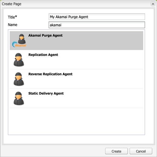
The following sample project demonstrates a custom replication agent which purges Akamai CDN (Content Delivery Network) cached content.
The full code for this blog is hosted on GitHub. There are three pieces to this project: the transport handler, the content builder, and the replication agent's user interface.
Transport Handler
TransportHandler implementations control the communication with the destination server and determines when to report back a positive
ReplicationResult to complete the activation and when to report back a negative ReplicationResult returning the activation to the queue.
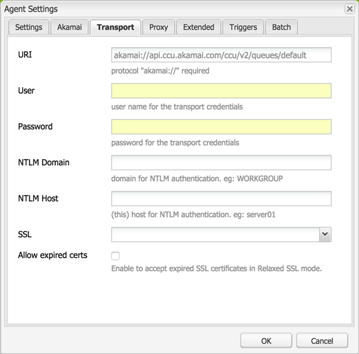
The default HTTP transport handler sends an authenticated request to the destination server specified in the "Transport URI" setting and expects an HTTP response with a status code of "200 OK" in order to mark the activation as successful. The Akamai CCU REST API responds with a status code of "201 Created" for a successful purge request. Therefore, a custom Transport Handler was utilized and given the responsibility for sending the POST requests, looking for 201 responses and returning the proper ReplicationResult.
The transport handler service determines which transport handler to use based on the overridden canHandle method. You'll notice that any replication agent configured with a "Transport URI" that begins with
http:// or
https:// will be handled by AEM's HTTP transport handler. The convention is to create a unique URL protocol/scheme and have your transport handler's canHandle method watch for Transport URIs that start with your URL scheme. For example, by navigating to a clean instance's
Agents on Author page, you'll find default AEM replication agents using
http://,
static://,
tnt://,
s7delivery:// and
repo://. In this example, the transport handler is activated on the
amakai:// scheme and uses the hard coded Akamai API REST endpoint. A popular convention is to set your transport handler's Transport URIs that start with something like "foo-", which allows the user to configure their replication agent with either "foo-http://" or "foo-https://" and have your transport handler simply remove the custom prefix before making the HTTP request.
The transport handler also handles other
ReplicationActionTypes. The Akamai example implements the standard "Test Connection" feature of replication agents by making a GET request to the Akamai API endpoint which expects a "200 OK" response in return - it's simply testing the replication agent's configured username and password. The example does not implement other replication action types such as deletions, deactivations, and polling (reverse).
When you speak of a replication agent, you're first thought will probably be of the default agent that moves content from author to publish via HTTP. Likewise, I've been discussing the Akamai transport handler example and its usage of HTTP GET and POST requests. However, it's important to note that your transport handler doesn't need to make HTTP calls. For example, you can write an FTP transport handler or a transport handler that interacts with the server's file system like the static replication agent does. Your transport handler can do anything as long as it returns a positive or negative replication result to update the queue.
Content Builder
ContentBuilder implementations build the body of the replication request. Implementations of the ContentBuilder interface end up as serialization options in the replication agent configuration dialog along side the Default, Dispatcher Flush, Binary less, and Static Content Builder options.
The provided Akamai example project could have been done without implementing a content builder; the logic in the content builder could have been completed in the transport handler as the transport handler created it's own request anyways. Another thing to consider is whether you need the session as ContentBuilder implementations gives you that while TransportHandler implementations do not.
A perfect example of utilizing the content builder is in Andrew Khoury's
Dispatcher refetching flush agent where the default HTTP transport handler is still used to communicate with the Dispatcher and only the HTTP request body needed to be built out in order for Dispatcher to fetch and re-cache content.
User Interface
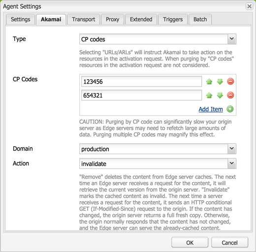
By implementing a content builder, the user can simply use a default replication agent and choose the custom serialization type. However, the Akamai replication agent requires the following custom configurations:
- an option to remove versus invalidate content
- an option to purge resources versus purging via CP Codes
- an option to purge the production versus staging domain
- the reverse replication option removed
A clean user interface was provided in order for users to implement and configure the Akamai replication agent. To accomplish this, a custom cq:Template as well as a corresponding cq:Component including the view and dialog was made. The easiest way is to copy the default replication agent from
/libs/cq/replication/templates/agent and
/libs/cq/replication/components/agent to
/apps/your-project/replication and update the agent like any other AEM component.
To keep things clean and simple, the Akamai replication agent component inherits from the default replication agent by setting the sling:resourceSuperType to
cq/replication/components/agent. The only update needed to the copied component was the dialog options and the agent.jsp file as it contains JavaScript to open the dialog for which you need to update the path. Any additions to the dialog can be retrieved through the TransportContext's
getConfig().getProperties() ValueMap.

Nate Yolles | December 10, 2015 | 958 comments |
You can easily convert an AEM
Page, Sling
Resource, or JCR
Node to JSON using the
org.apache.sling.commons.json.jcr.JsonItemWriter class. This simply but useful utility allows you to dump a Node into a
JSONObject. It also allows you to dump the Node into a JSON string into a
PrintWriter for use in servlets for example.
The constructor accepts a
Set of Strings representing JCR properties to exclude from the JSON output. You may want to ignore the standard
cq:*,
sling:* and
jcr:* properties while allowing only your custom properties to populate the JSON.
The overloaded dump methods allow you to pass in the recursion level similar to how you would use a selector when making AJAX calls to the
Default Get Servlet. Just as you can cURL
/content/geometrixx/en.json,
/content/geometrixx/en.1.json and
/content/geometrixx/en.-1.json, you can pass in a positive integer for the recursion level as well as
-1 for infinite recursion.
Likewise, just as you can cURL
/content/geometrixx/en.tidy.json, you can specify whether you want the JSON output nicely formatted or not.
The following examples demonstrate the JsonItemWriter utilizing a PrintWriter in a servlet and a JSONObject in a standard Java class.

Nate Yolles | November 16, 2015 | 997 comments |
Using checkboxes in your Adobe Experience Manager component dialogs can be confusing to the new component developer. A few quick examples will reveal just how easy they really are. However, this article is meant to be more than a back-to-basics. We'll discuss best practices and take the opportunity to introduce the Sling Post Servlet. This is where many web developers and engineers have a breakthrough and recognize AEM for what it is - a powerful set of features and APIs, but at its core, it's simply an Apache Sling application.
Before diving into AEM's use of checkboxes, it's important to know the basics of how checkboxes are handled in ordinary HTML. Reading into the
HTML5 specification
, we find two important rules regarding checkboxes:
- "If the field element has a value attribute specified, then let value be the value of that attribute; otherwise, let value be the string 'on'." (See: 4.10.5.4 Common input element APIs, default/on)
- "When a form is submitted, only 'on' checkbox controls can become successful." (See: 4.10.22.4 Constructing the form data set)
The first bullet point simply means that the default value of a checkbox is the string literal "on" if a value attribute is not defined on the element. The second bullet point has much greater ramifications and will lead us into the topic of the Sling Post Servlet. The HTML specification states that while a checkbox in the on state is submitted with the default/on value, a checkbox in the off state is not submitted at all. The result is that the server will not receive a "false", null or "off" value for an unchecked checkbox, but rather will not receive either the name or a value in the form post.
The real power to control checkboxes in AEM is provided from the
Sling Post Servlet. Sling provides nine suffixes, four of which we will concentrate on in this article. A suffix is used by submitting an additional request parameter with the parameter name appended with an "@" symbol and the suffix. For example, if you want to act on the "foo" parameter, you would submit "foo@SuffixName" in addition to the "foo" parameter.
Saving checkbox values as Boolean value types in the JCR
When posted to Sling and saved to the JCR, the default property type is String. While this is workable, wouldn't you rather have a Boolean value saved as a Boolean property type? When working in the strongly typed Java language you would use the boolean primitive or Boolean wrapper rather than a String literal to represent a Boolean value, so why not do the same in the JCR? You can use the Sling Post Servlet's
TypeHint suffix to instruct Sling to set the property type as a Boolean (or other valid value type for that matter).
Removing checkbox values in the off state
In accordance with the HTML specification and as we previously discussed, an unchecked checkbox is not submitted. AEM takes care of this task for us when using the out-of-the-box Classic and Touch UI checkbox or selection controls. However, if you create something custom such as dynamically added checkboxes or checkboxgroups in your dialog, you might find that Sling and thus AEM is never notified when the author unchecks a checkbox. If you were unfamiliar with the Sling Post Servlet, you might end up writing a lot of JavaScript logic using listeners and the CQ Widget API's events. The better alternative is to use the Sling Post Servlet's
Delete suffix. The
Delete suffix instructs Sling to always delete the JCR property before taking action with the request parameters. If the checkbox is unchecked, the JCR property is deleted and since a value wasn't submitted, no property is created in its place. If the checkbox is checked, the JCR property is deleted and simply recreated with the new value, whether the value is the same as before or otherwise.
Setting checkbox values in the off state
The
DefaultValue suffix instructs Sling to use a given default value should the request parameter not have a value. This alone isn't helpful in the case of an unchecked checkbox because neither the name nor value will be submitted. However, the
DefaultValue will be considered when used in addition to the
UseDefaultWhenMissing suffix because just as the suffix states, the value of an unchecked checkbox will be "missing" so the default value is used.
Tying it all together
So while you can use the
Delete suffix to completely remove a JCR property, you can use the
DefaultValue and
UseDefaultWhenMissing in conjunction to guarantee that a JCR property will always be present with a value. In fact, by combining the
TypeHint,
DefaultValue and
UseDefaultWhenMissing suffixes, you can ensure a semantically correct Boolean JCR property type is always created with a proper value of true or false.
cURL simulations
Run the following cURL commands against a running AEM/CQ instance and observe the JCR property values as well as the JCR property type.
AEM/CQ component dialogs
The most common checkbox control in the Classic UI is the
CQ.form.Selection xtype with its type set to
checkbox. By default the Selection/Checkbox control will save the JCR property as the String literal "true." You can use the
TypeHint suffix to save the String value as a true Boolean by either setting the
checkboxBoolTypeHint config option or by creating a
CQ.Ext.form.Hidden field for the
TypeHint request parameter.
You can also use Ext JS's
CQ.Ext.form.Checkbox and
CQ.Ext.form.CheckboxGroup xtypes in the Classic UI as the most basic checkbox controls. By default the Checkbox xtype will simply submit the default/on value, meaning if you don't specify a value, the default value is "on." You can use the
inputValue config option to change the value to the String literal "true" and you can use the
TypeHint suffix to save the String value as a proper Boolean.
In the new Granite Touch UI, use the
granite/ui/components/foundation/form/checkbox resource to create the checkbox and the
granite/ui/components/foundation/form/hidden resource for the
TypeHint suffix. The checkbox resource has the
deleteHint option to create the Sing Post Servlet
Delete suffix for you.
Retrieving Boolean values
One point to keep in mind is that when you set a checkbox to checked as default dialog, the JCR property is not set until the dialog is opened and saved for the first time. A newly created component will not have that
true Boolean value that your Sightly or JSP will be looking for. Therefore, you need to also make sure that your logic is defaults to the
true value if the JCR property doesn't exist.
Conclusion
We discussed the basics and best practices of using checkboxes in AEM component dialogs. However, the checkboxes were a mere prelude into an introduction to the Sling Post Servlet. Hopefully you've come to realize what happens when you update a component; while AEM provides valuable functionality such as validation through Ext JS or Granite, ultimately, the component dialog is simply an HTML form posting to Apache Sling, which in turn handles the JCR update. We introduced four Sling Post Servlet Suffixes. It's important to know that their uses are not limited to checkboxes and that there are five other suffixes to explore, which are detailed in the
documentation. You'll find that the Sling Post Servlet is extremely powerful and invaluable in the case of AEM component dialogs especially for checkboxes and multi-value properties.